Pink Daisies
One of the outcomes of this project of looking intently at the natural world has been a new appreciation for wildflowers. The flashy blooms resulting from commercial breeding are striking, but they lack the subtle range of hues found in their wild cousins. Nevertheless, sometimes it's fun just to play with crayons....
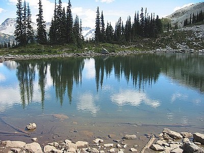
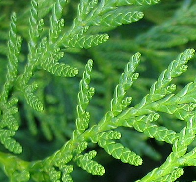
This is photo from my parents' yard, which they sent the other day:
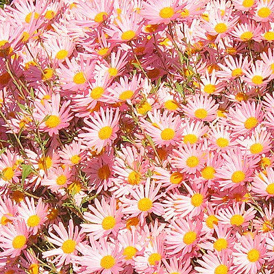
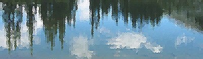
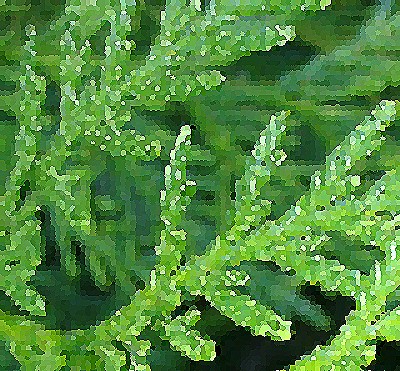
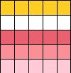
It's an extraordinarily lovely picture, but the colour range is really only this:
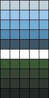
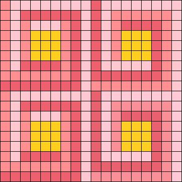
The most striking pattern feature is those sunny yellow polka dots on a cotton candy pink ground - not something I'd wear, but perfect for a little girl's spring cardigan. Intarsia is (still) not my thing, however, back when my son was born, I played for a while with a modular garter stitch garment in brightly coloured cotton. He outgrew that particular yarn supply before I got anywhere with it, but I loved the way the cotton behaved in a multidirectional garter stitch.
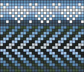
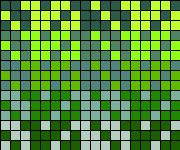
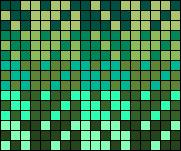
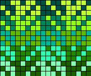
Perhaps something along these lines:
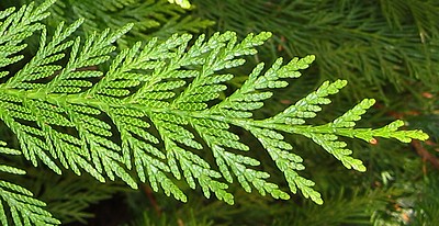
This is photo from my parents' yard, which they sent the other day:
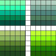
It's an extraordinarily lovely picture, but the colour range is really only this:
The most striking pattern feature is those sunny yellow polka dots on a cotton candy pink ground - not something I'd wear, but perfect for a little girl's spring cardigan. Intarsia is (still) not my thing, however, back when my son was born, I played for a while with a modular garter stitch garment in brightly coloured cotton. He outgrew that particular yarn supply before I got anywhere with it, but I loved the way the cotton behaved in a multidirectional garter stitch.
Perhaps something along these lines:
posted by Ruth at 6:38 PM
0 comments
![]()
![]()