Cedar: Part 1
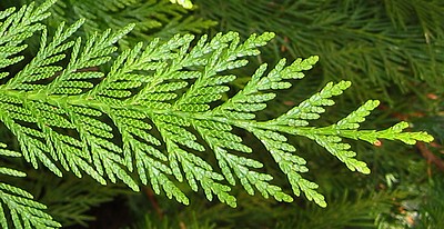
Cedar is one of those plants that has become so ubiquitous in landscaping as to be scarcely noticed for its own beauty. Here on the west coast, of course, it is inextricably linked with First Nations art and tradition, and the few old growth giants passed over by the logging companies are awe-inspiring monuments of strength and history.
A close look reveals a branching pattern which would be lovely interpreted in twisted stitches (a future project):
What looks at a glance like a monochromatic dull green, is in fact, a whole range of hues:
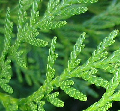
The "squinty view":
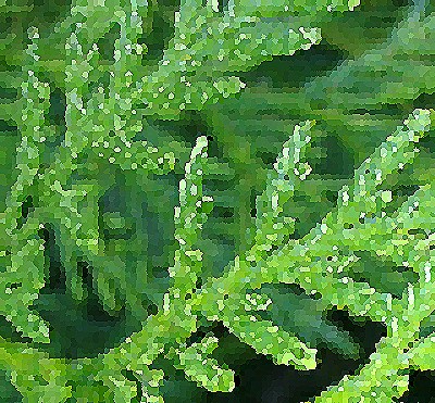
reveals both a blue-green and a yellow-green range of hues.
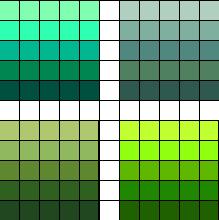
Since a core principle of Fair Isle is the maintenance of consistent contrast between saturation levels, I tried playing with the saturation setting in the photoeditor. On the top is the blue-green palette, with the identical set of hues in saturated (left) and desaturated (right) form. On the bottom is the yellow-green palette with the desaturated version on the left, and saturated on the right.
I created a simple interlocking pattern of branches in order to play with the colour combinations.
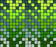
Here is the saturated version of the yellow-green range set against desaturated blue-greens:
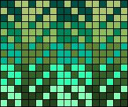
Saturated blue-greens against desaturated yellow-greens:
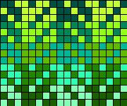
Both ranges equally saturated - note in this case how the middle hues don't really contrast sufficiently:
If a uniformly saturated palette were imperative, one could experiment with eliminating the middle hue range, or toss in a complementary colour for extra spark - perhaps the reddish brown of cedar bark? There's infinite scope for play.
A close look reveals a branching pattern which would be lovely interpreted in twisted stitches (a future project):
What looks at a glance like a monochromatic dull green, is in fact, a whole range of hues:
The "squinty view":
reveals both a blue-green and a yellow-green range of hues.
Since a core principle of Fair Isle is the maintenance of consistent contrast between saturation levels, I tried playing with the saturation setting in the photoeditor. On the top is the blue-green palette, with the identical set of hues in saturated (left) and desaturated (right) form. On the bottom is the yellow-green palette with the desaturated version on the left, and saturated on the right.
I created a simple interlocking pattern of branches in order to play with the colour combinations.
Here is the saturated version of the yellow-green range set against desaturated blue-greens:
Saturated blue-greens against desaturated yellow-greens:
Both ranges equally saturated - note in this case how the middle hues don't really contrast sufficiently:
If a uniformly saturated palette were imperative, one could experiment with eliminating the middle hue range, or toss in a complementary colour for extra spark - perhaps the reddish brown of cedar bark? There's infinite scope for play.
posted by Ruth at 6:15 PM
![]()
![]()

0 Comments:
Post a Comment
<< Home