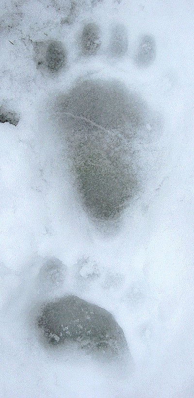
Bear Knitted
posted by Ruth at 10:27 AM
0 comments
![]()
![]()
A growing collection of original patterns, as published on Saturdays in Knitting on Impulse. Copyright 2006; all rights reserved.

![]()
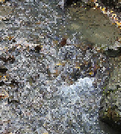
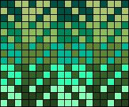
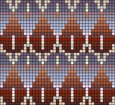
Chocolate, lavender, and a touch of cream - who knew soggy decay was so delectable?

posted by Ruth at 1:16 PM
0 comments
![]()
![]()
posted by Ruth at 1:11 PM
0 comments
![]()
![]()
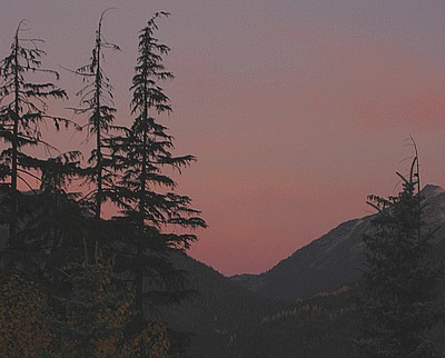
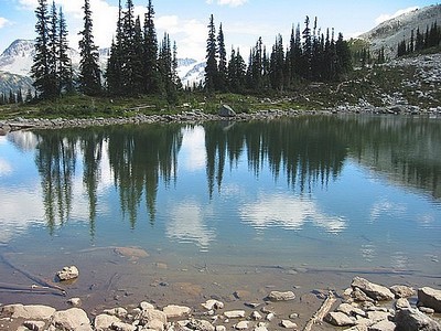
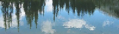
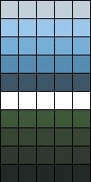
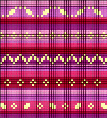
I have always been fascinated by the colour progression of sunrise:
![]()
The subtly graduated palette: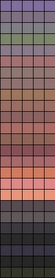
posted by Ruth at 1:07 PM
0 comments
![]()
![]()
posted by Ruth at 6:38 PM
0 comments
![]()
![]()
posted by Ruth at 6:29 PM
0 comments
![]()
![]()
posted by Ruth at 6:15 PM
0 comments
![]()
![]()
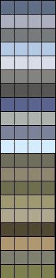
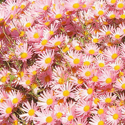
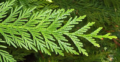
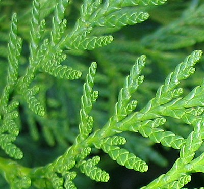
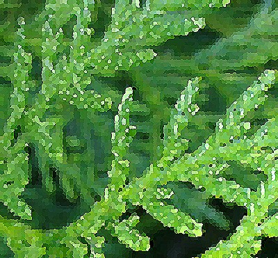
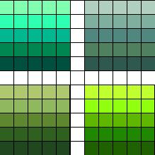
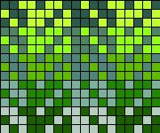
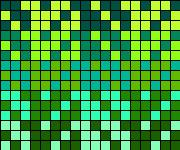
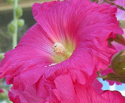
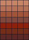
I pulled out quite a wide range of colours: 
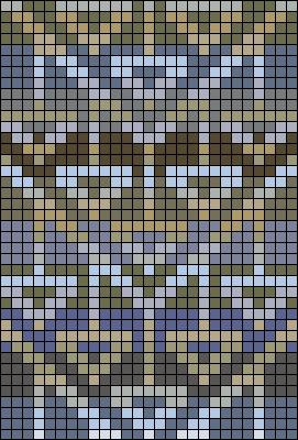
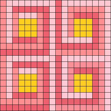
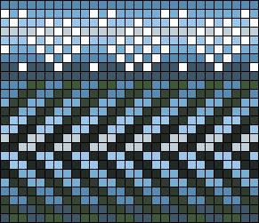
A 30 x 22 stitch repeat: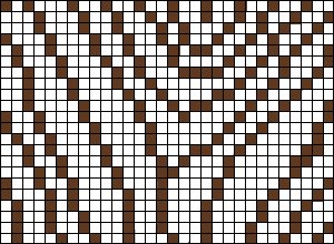 Carefully plotted so that all four sides line up thus:
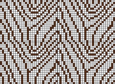
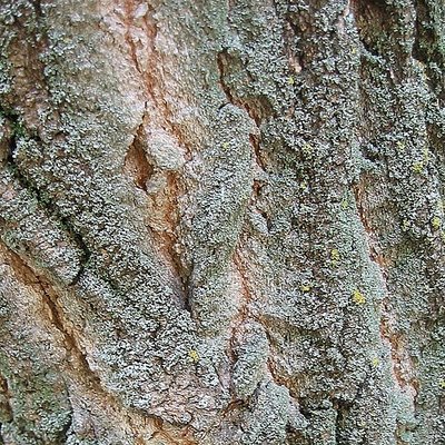
I envision pulling colours from the palette above, and arranging them in random stripes , with the pattern in a deep chocolate brown or even a charcoal gray. Then again, a suitably hued handpaint would also make a lovely background. In the original photo, I love the way the little bits of buttery yellow lichen on the bark make the rest of the colour scheme pop - I would be tempted to duplicate stitch a few spots here and there for effect.
posted by Ruth at 10:03 AM
0 comments
![]()
![]()
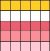
The pattern: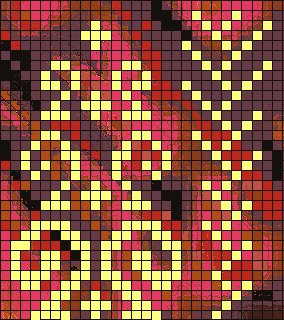
Designed for solid yarn on a handpainted backdrop.
posted by Ruth at 8:13 PM
0 comments
![]()
![]()
I love conversation, but hate spam - if you want to contact me, email me at ruthrob1 AT whooshnet DOT com (you know what to do...)

